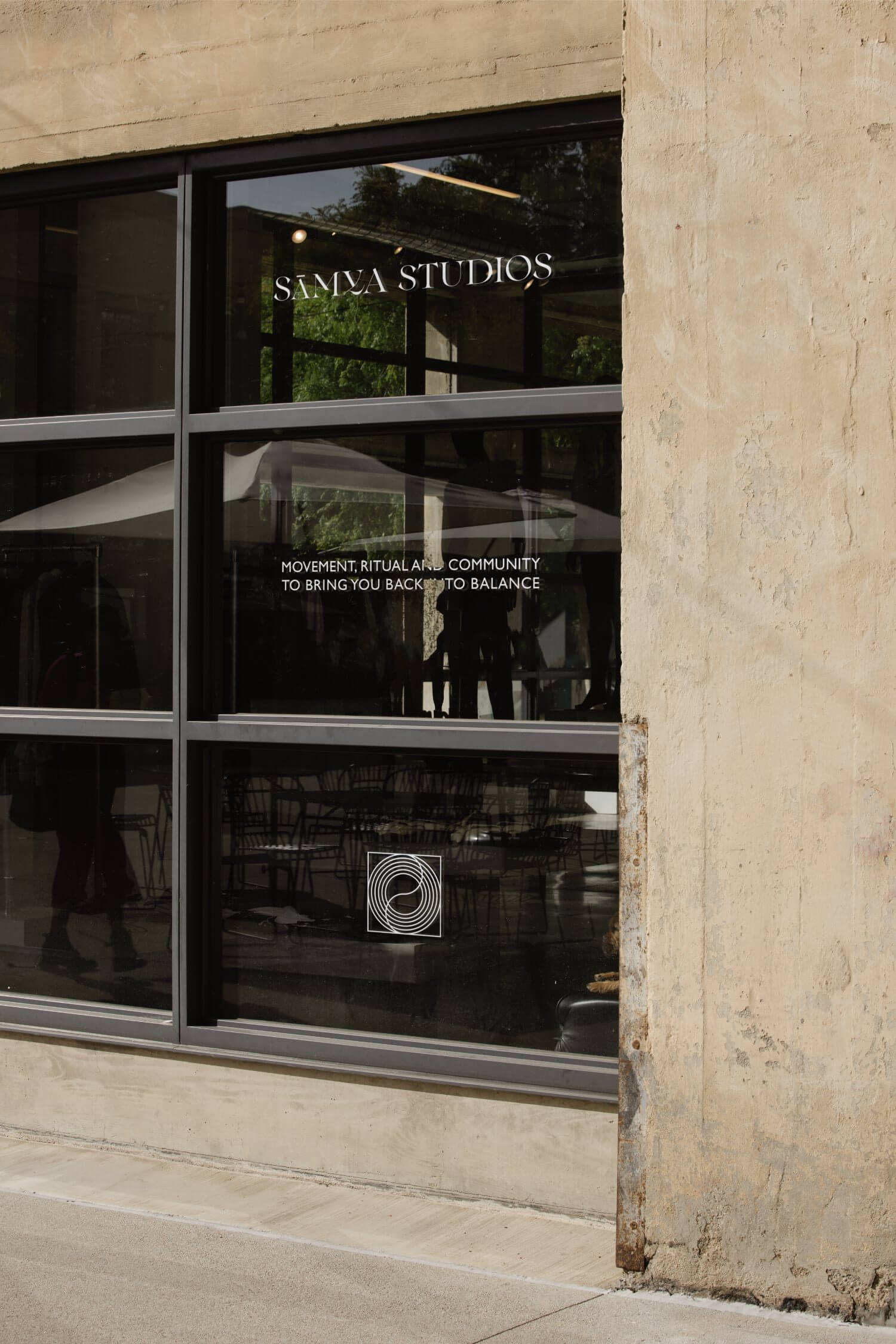
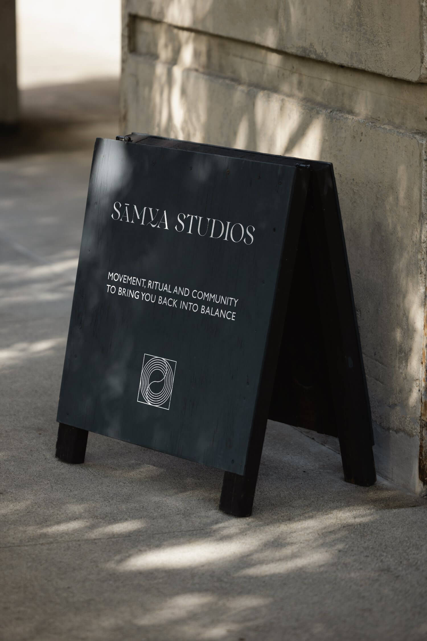
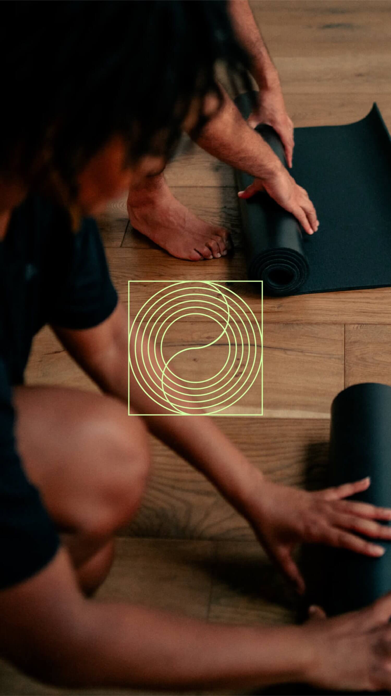
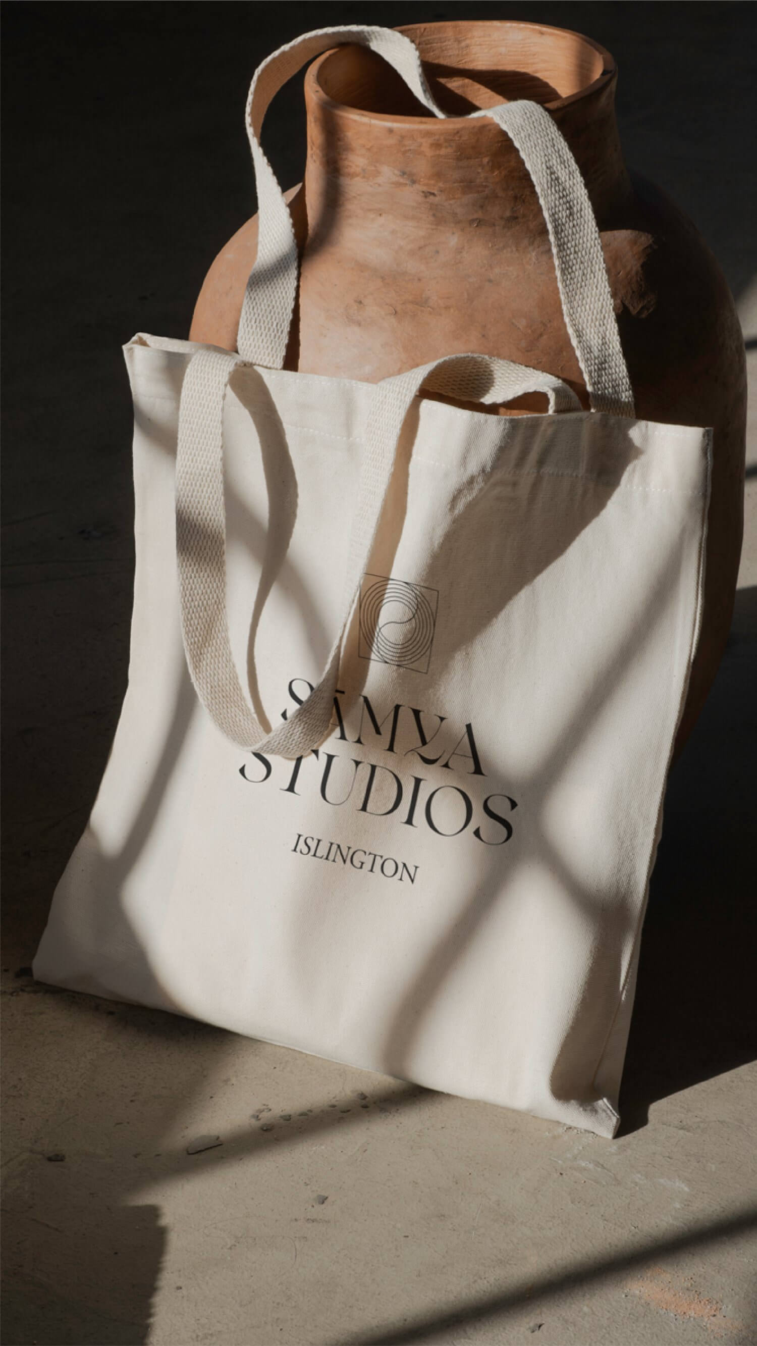
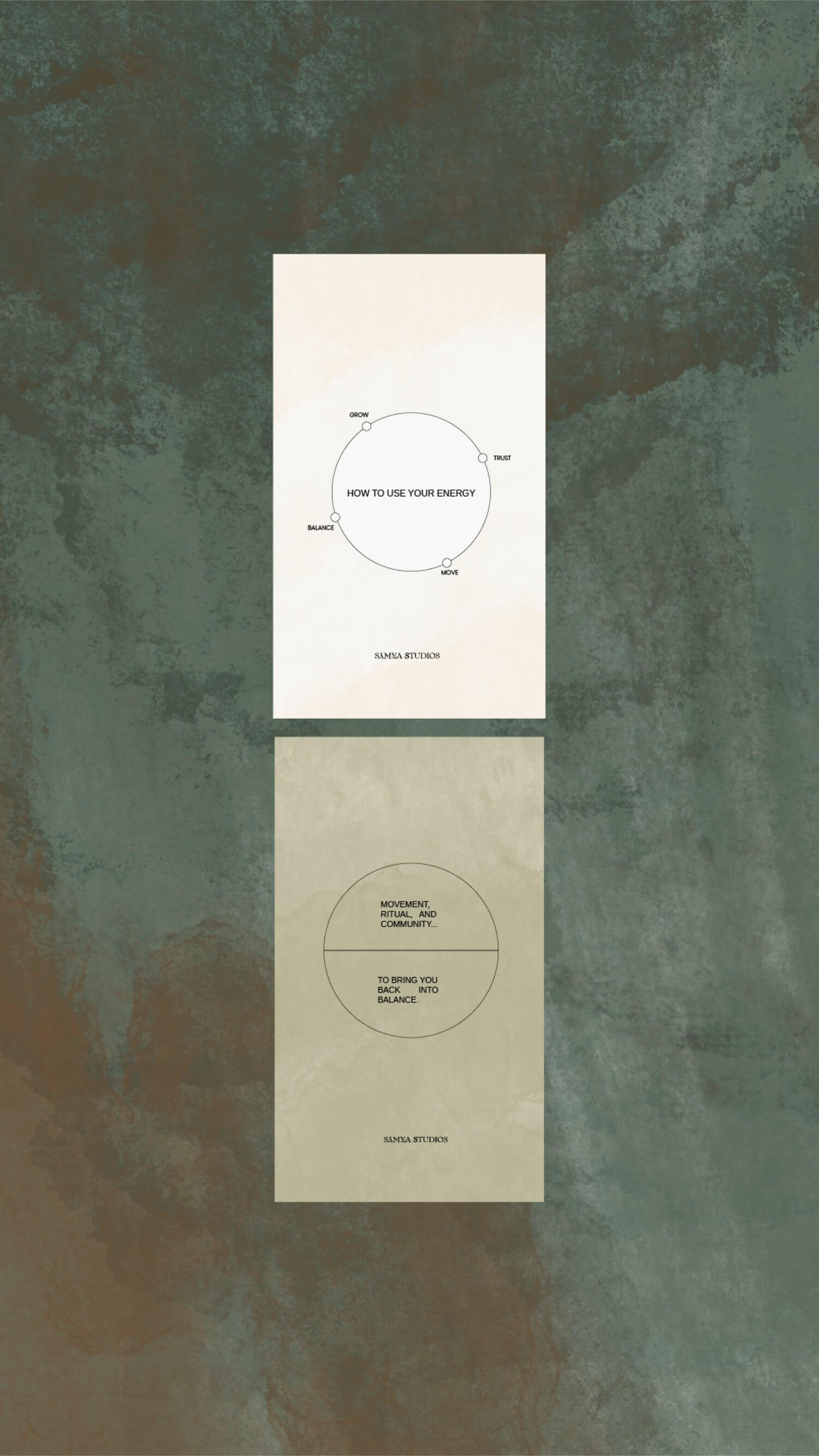
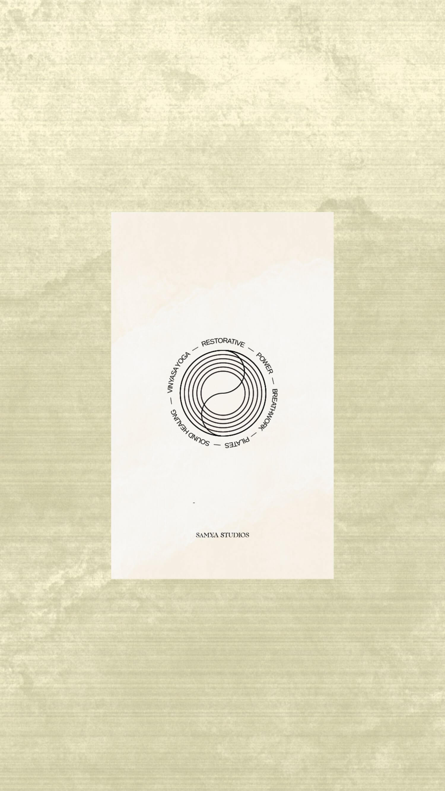
Sāmya Studios is a neighbourhood destination for yoga, Pilates and breathwork in London. The brief was to create a visual language that could translate across every brand touchpoint. At the heart of our creation is a bespoke logo and circular symbol, inspired by movement, connection, calmness and shared space. The earthy, neutral colour palette, brought to life with vibrant accents of orange and lime green, draws inspiration from founder's Laura and Jade’s childhood homes in California and Morocco. A collection of tactile, textured backgrounds adds depth and versatility across social media, promotional materials and the wider visual identity. We then translated this into a fully custom-coded, website, using texture, video and animation to create an immersive digital experience that captures the atmosphere of the studio and allows the Sāmya community to discover and book workshops and events.

 back